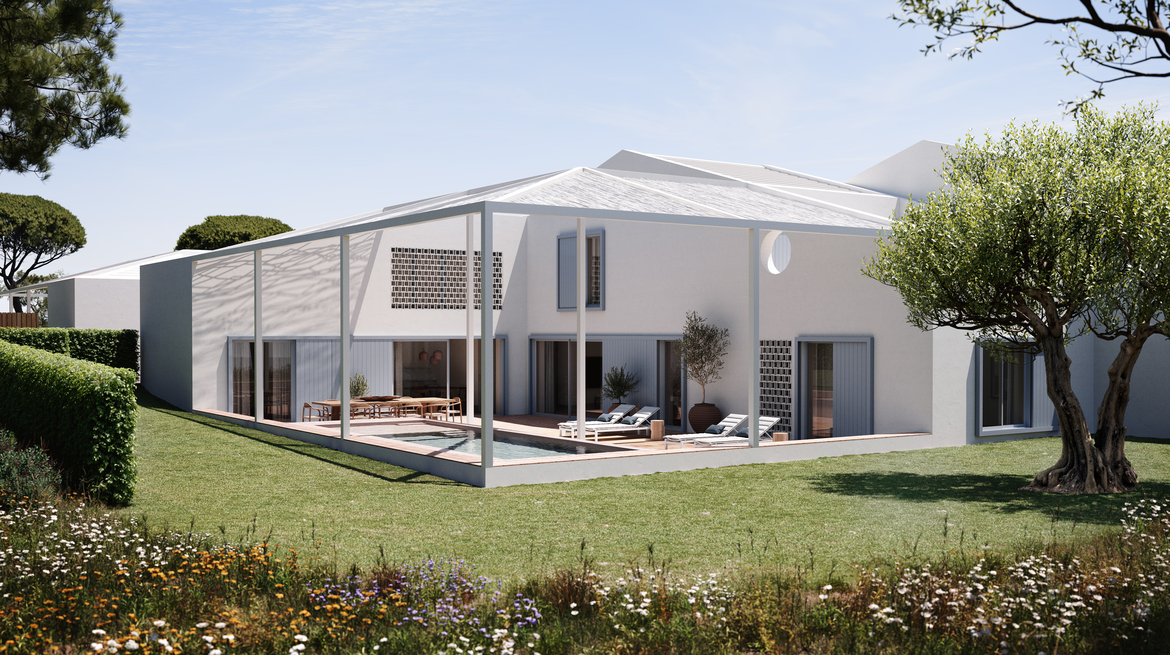
A panoramic way of living
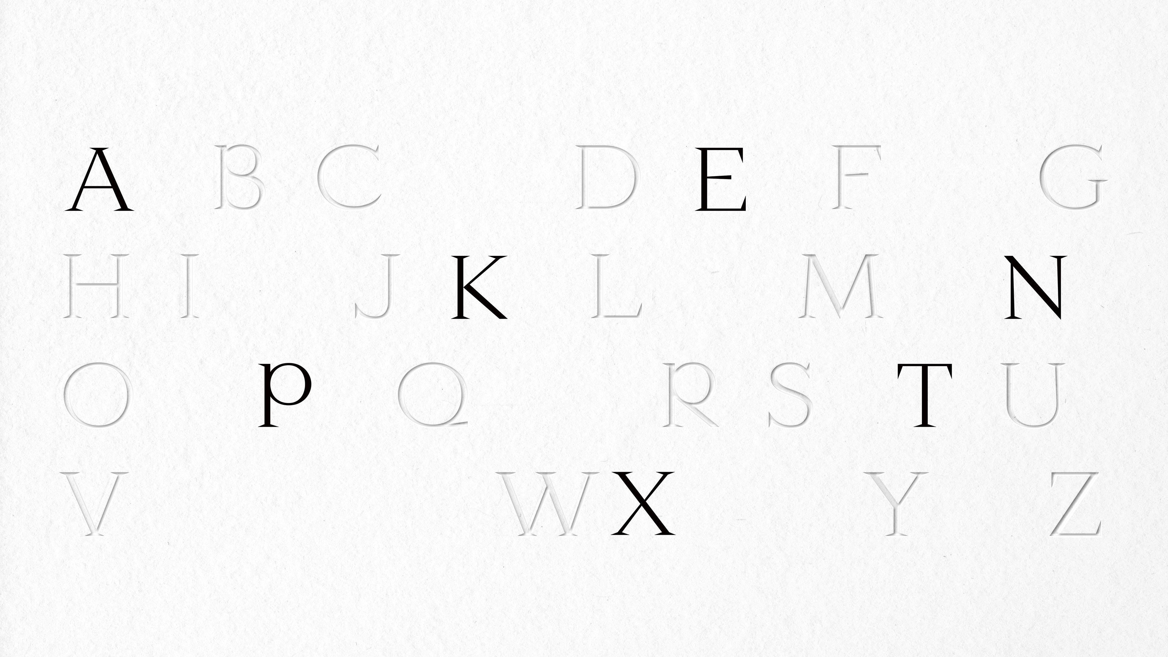
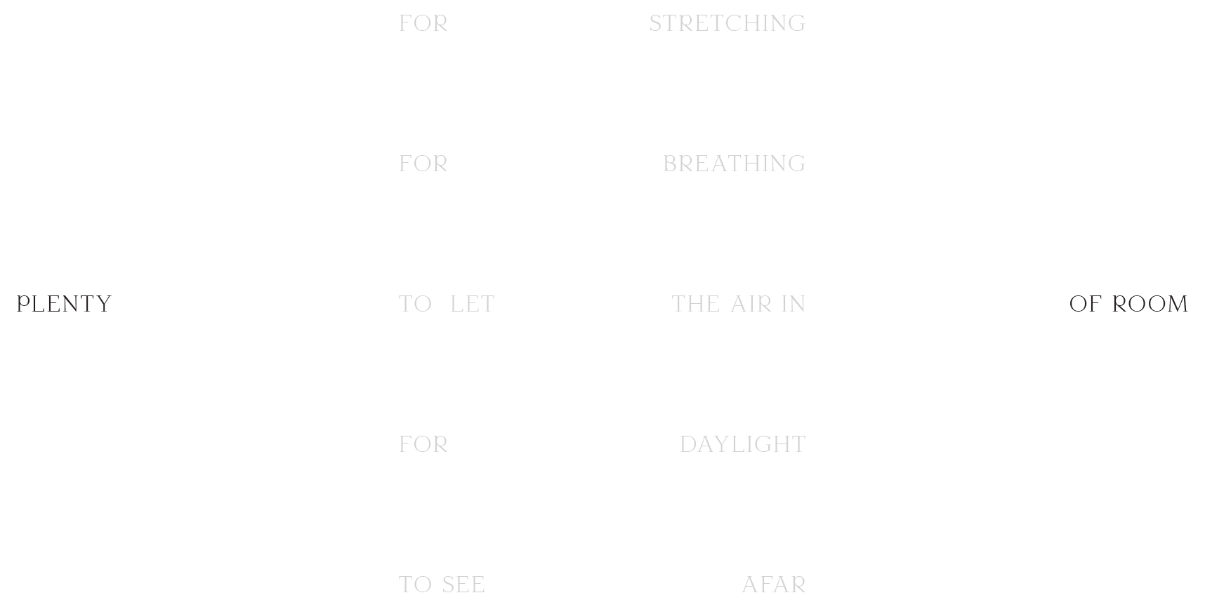
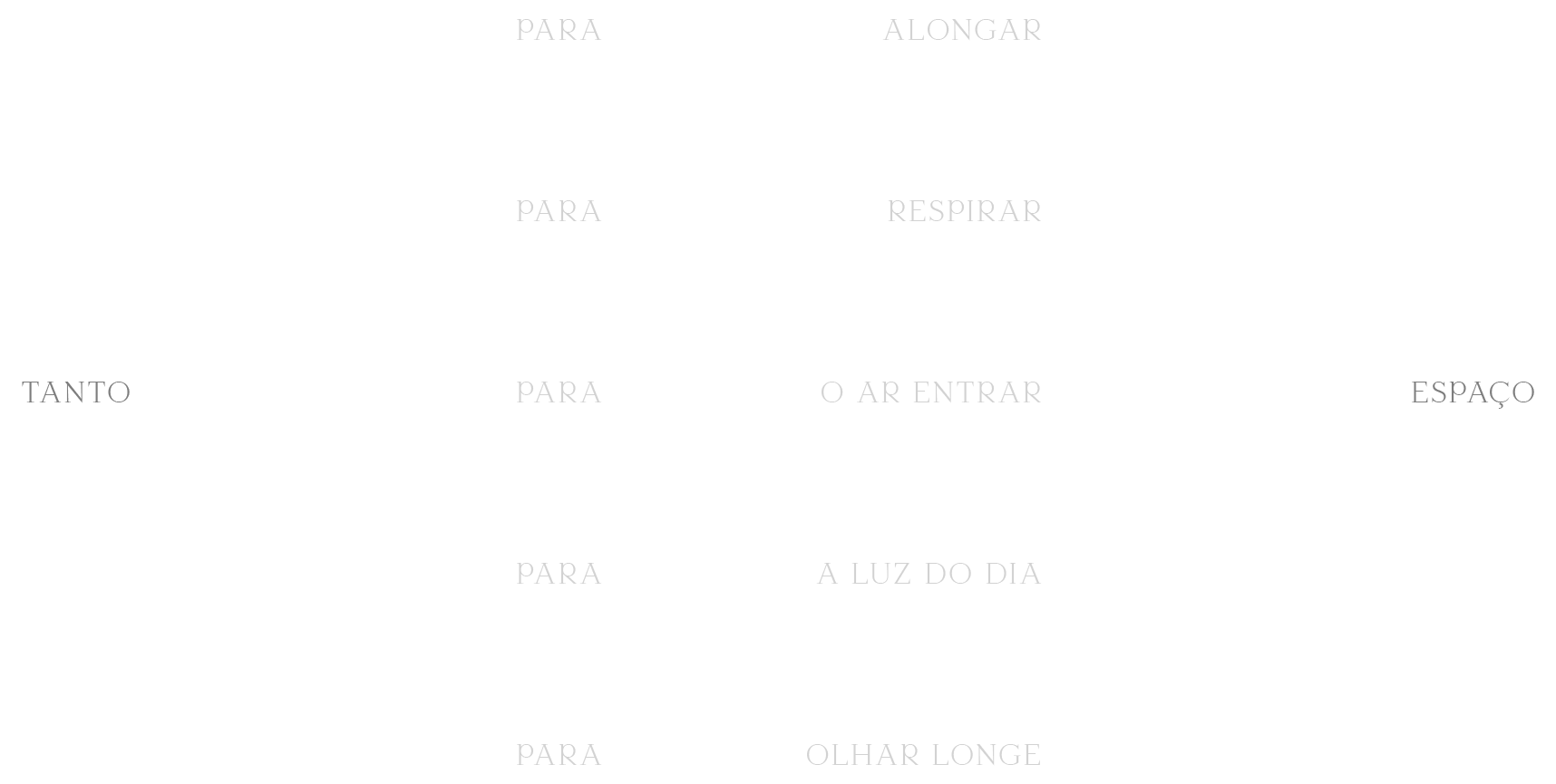
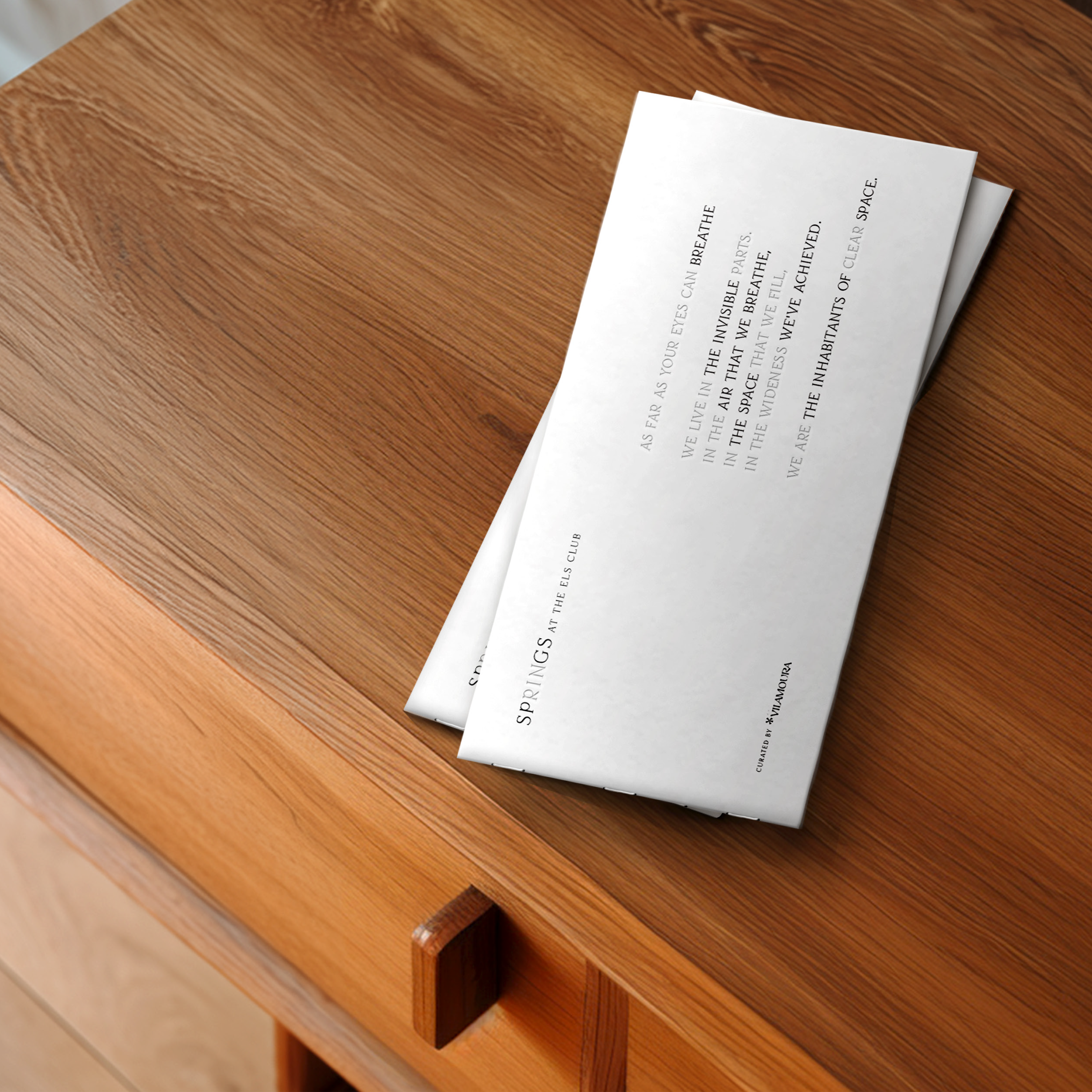
This brand is the true portrayal of the wideness you live at Springs - A typographic brand that aims to (almost literally) represent the invisible space. The word 'Springs' appears somewhat incomplete, emphasising the abbreviation 'SPGS' and the blank space between.
The letters RIN, always appear in a subtle, almost invisible way, again accentuating the extension. Everything about it is focused on the privilege of living in a wide space.
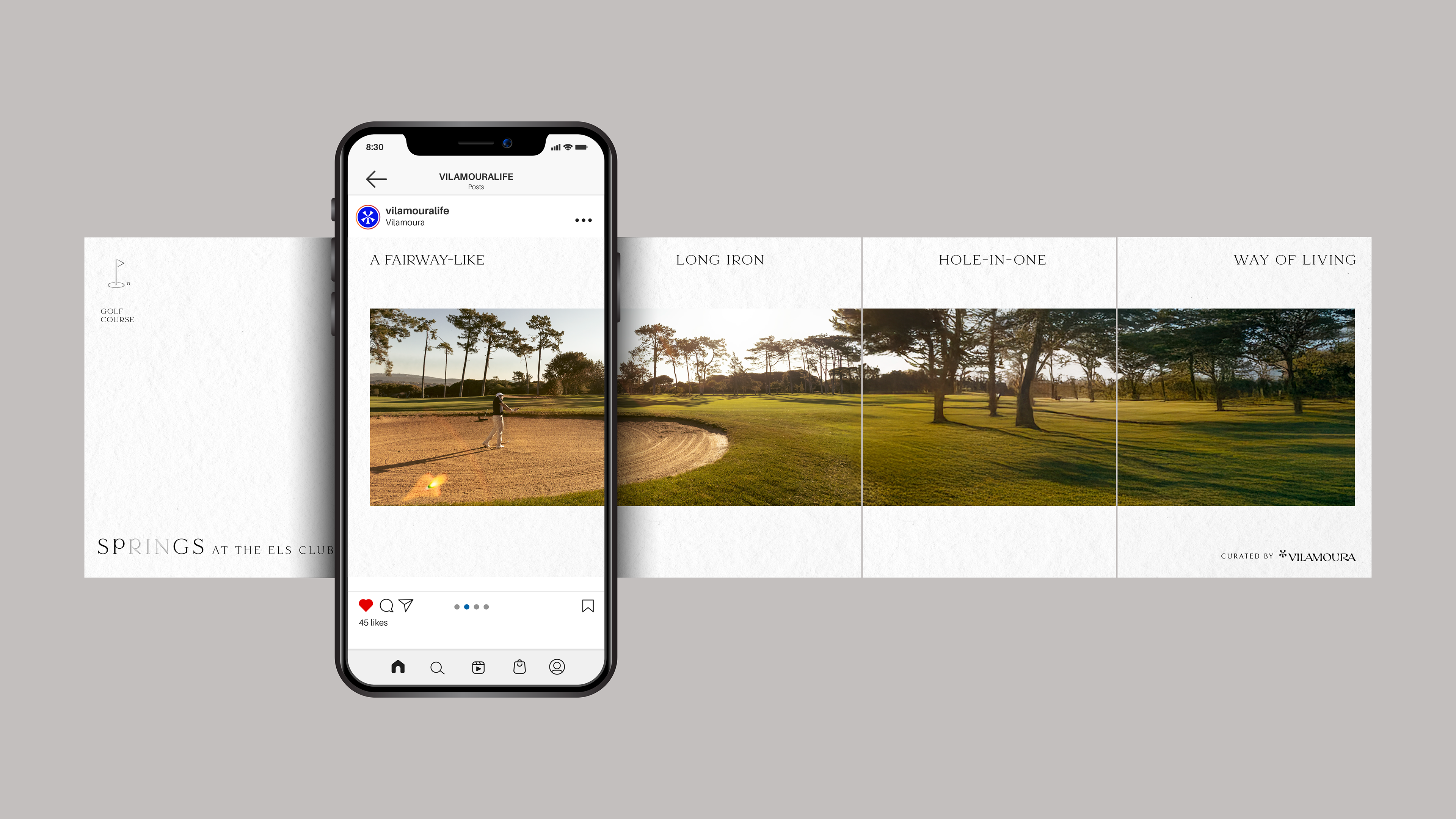
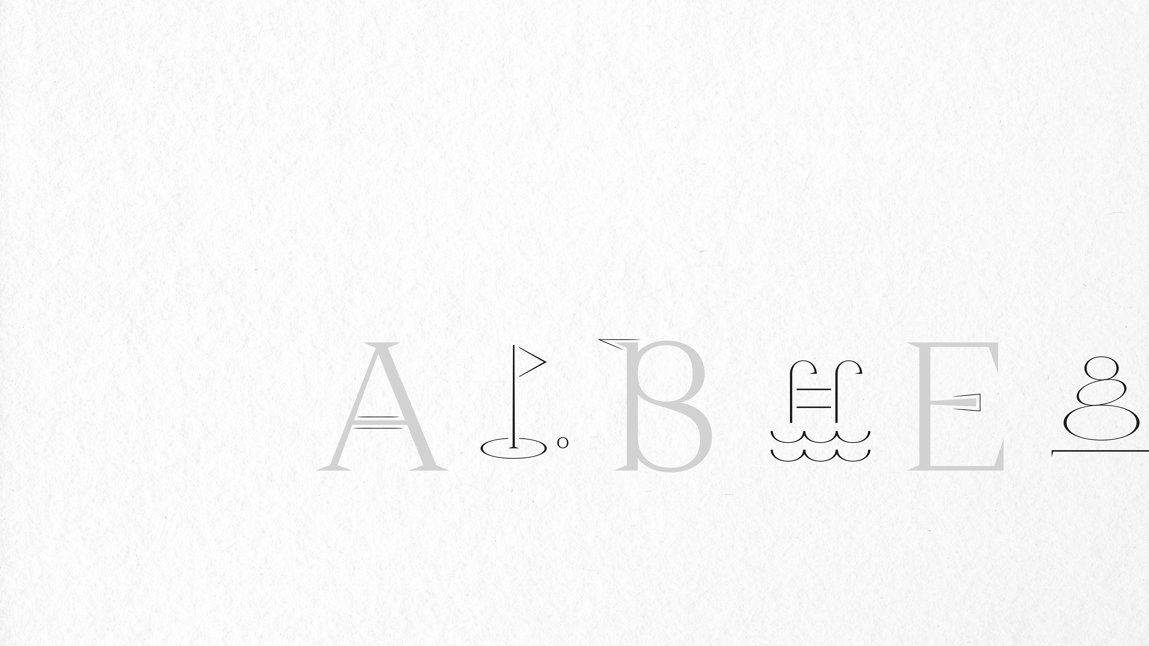
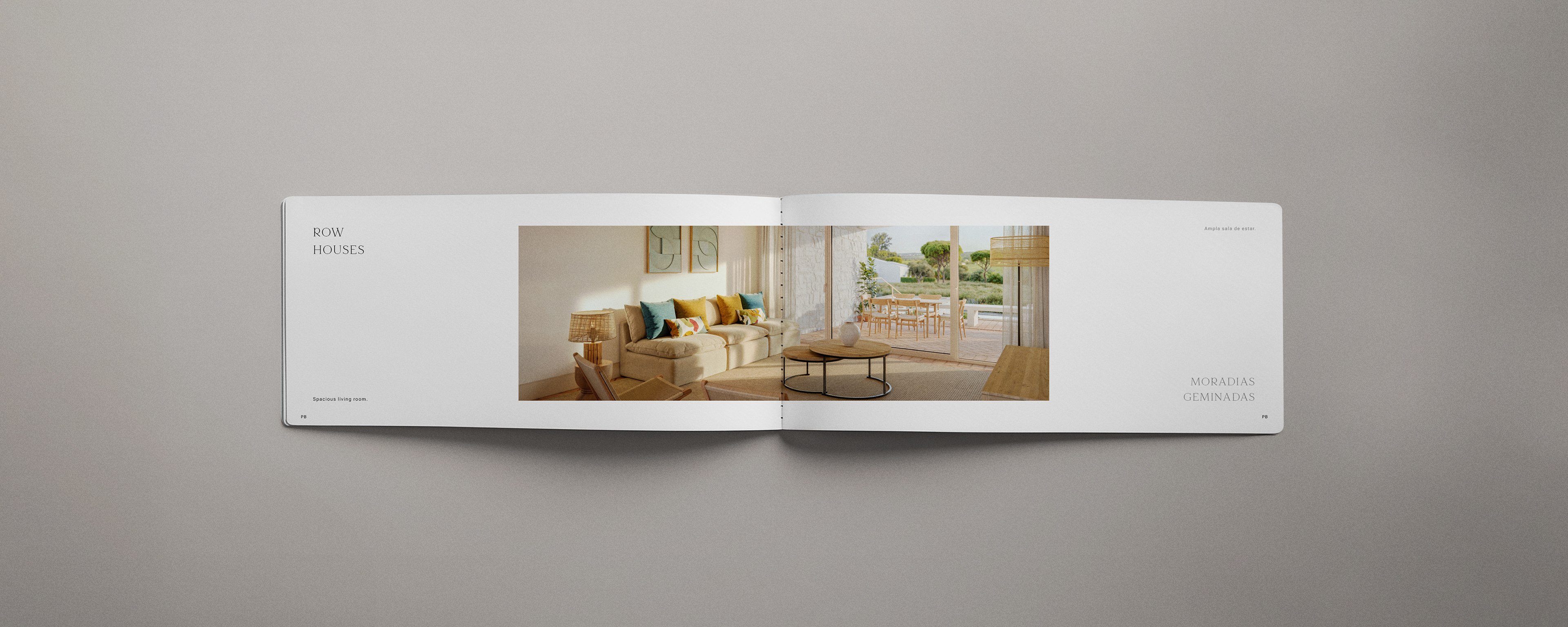
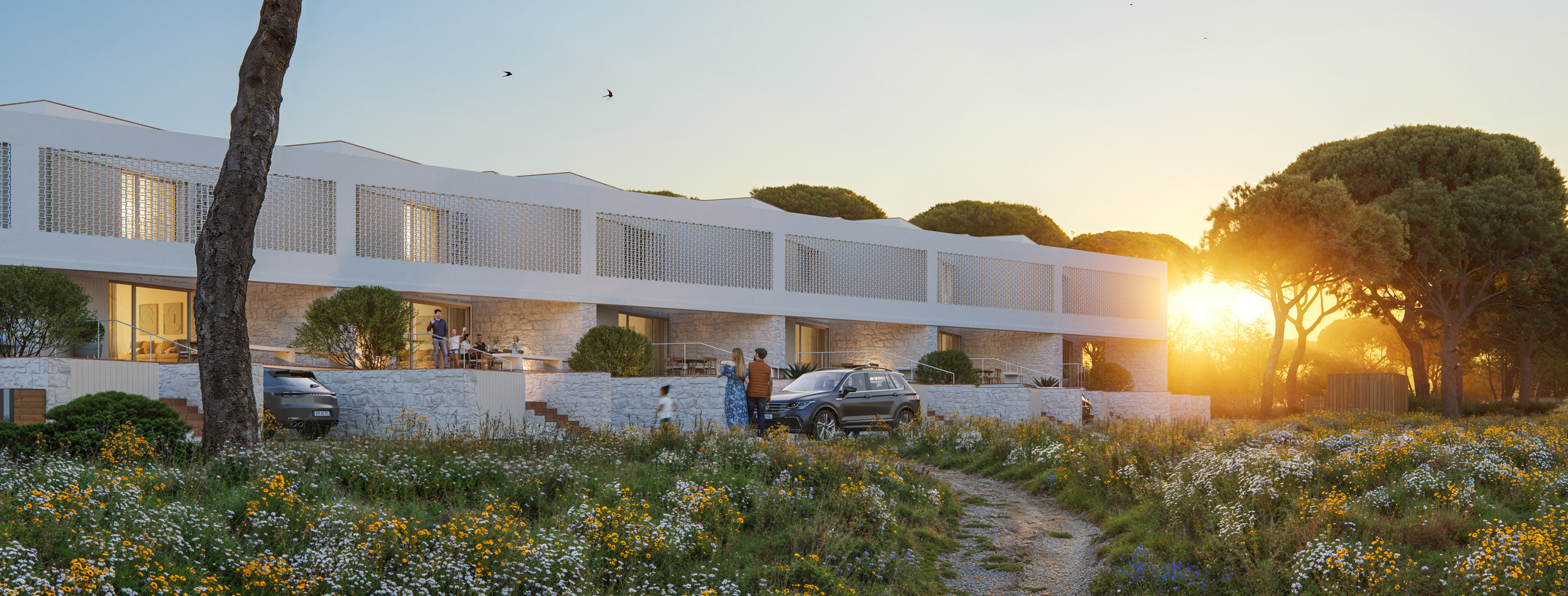
From the typography, which was created from scratch, to the iconography, imagery and the tone itself, every detail accentuates the luxury of having nothing around but peace of mind.
The letters RIN, always appear in a subtle, almost invisible way, again accentuating the extension. Everything about it is focused on the privilege of living in a wide space.
From the typography, which was created from scratch, to the iconography, imagery and the tone itself, every detail accentuates the luxury of having nothing around but peace of mind.


You may also like