Mirror, Mirror on the Sea, who will overcome this challenge but me?
Who better to appreciate me than myself?
How can I achieve it all but on my own?
Who better to appreciate me than myself?
How can I achieve it all but on my own?
–
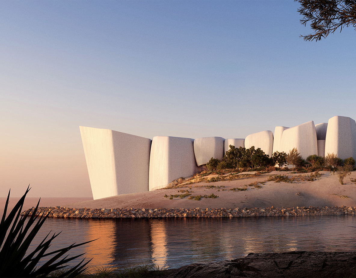
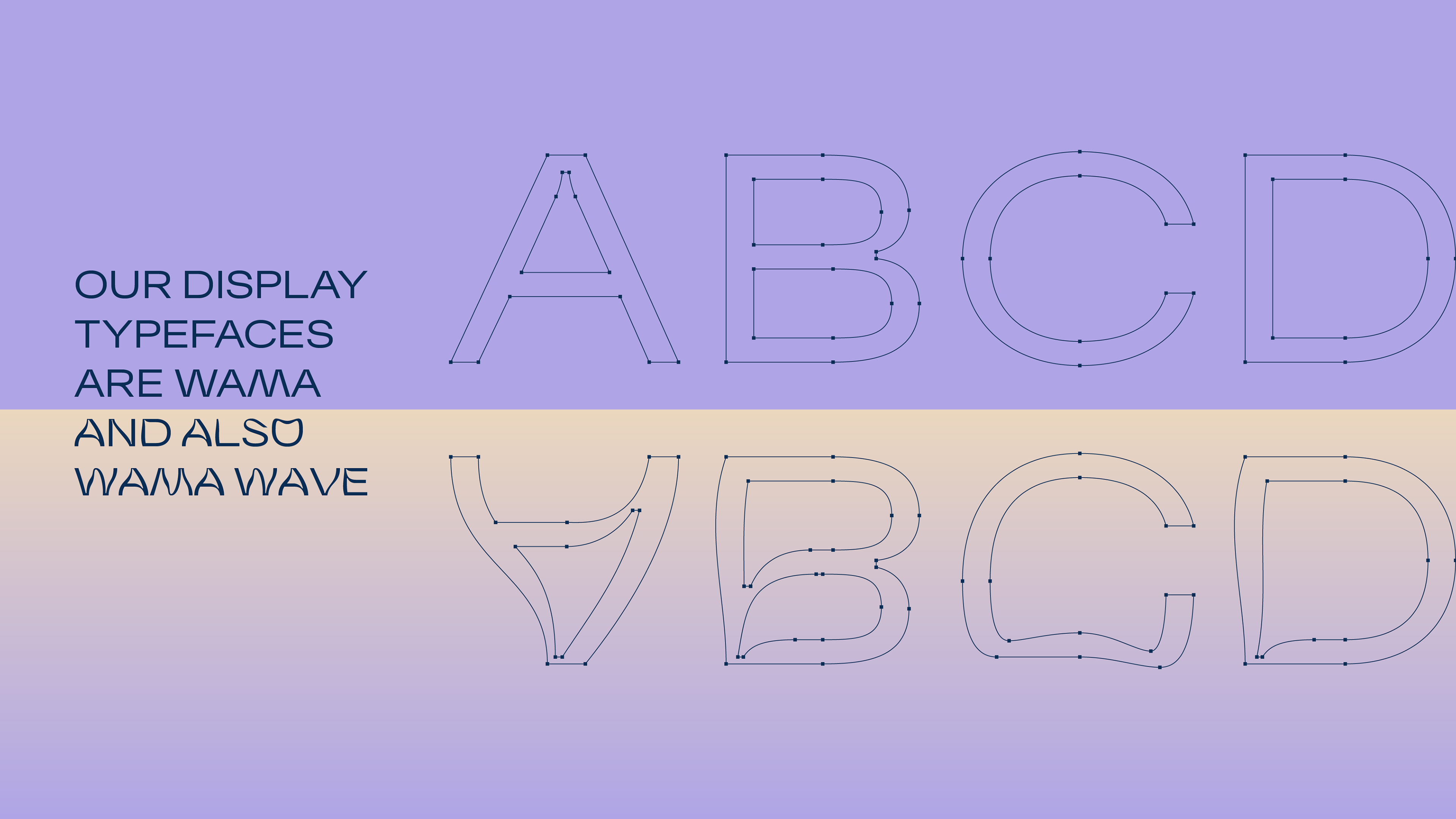
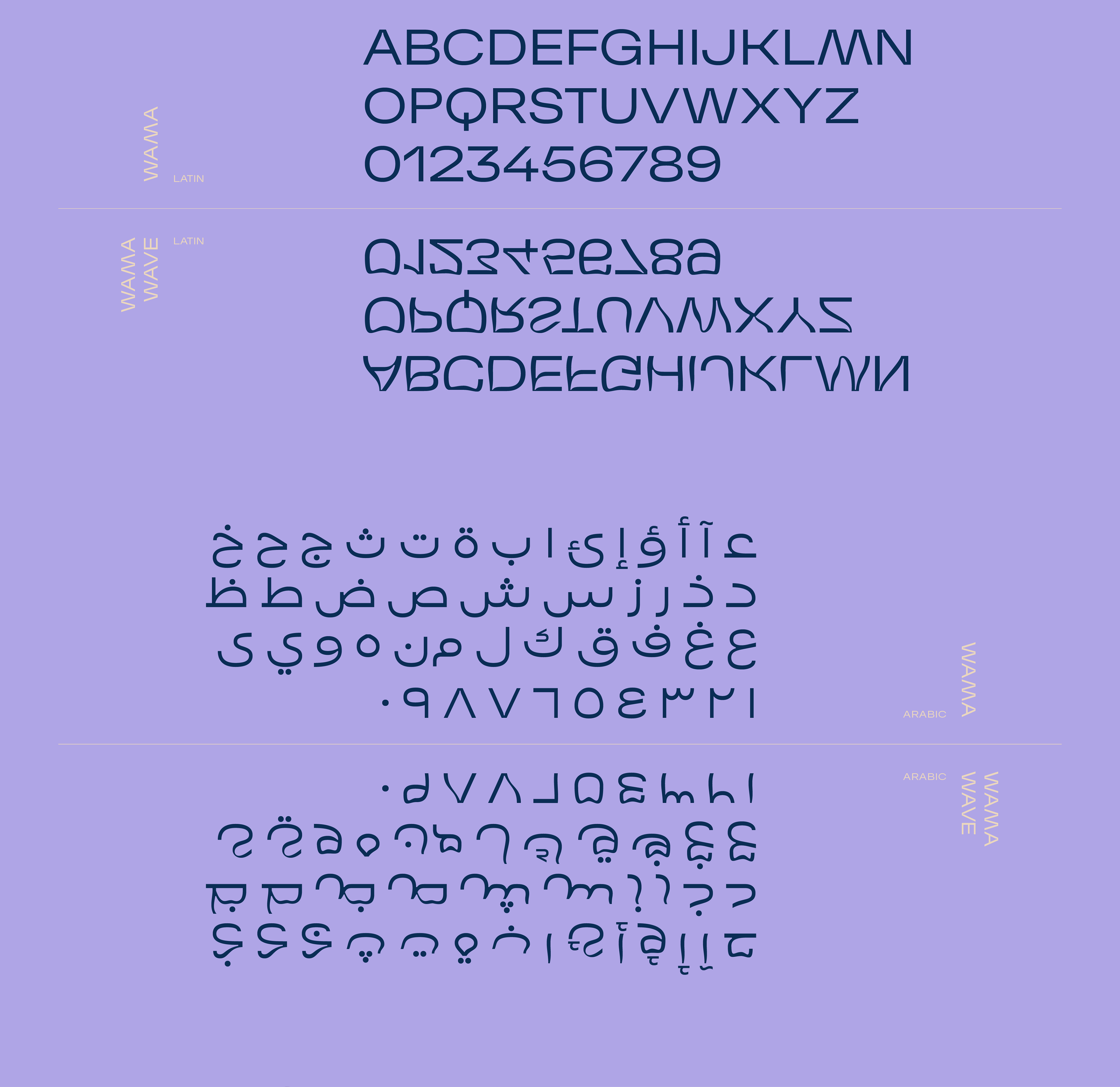
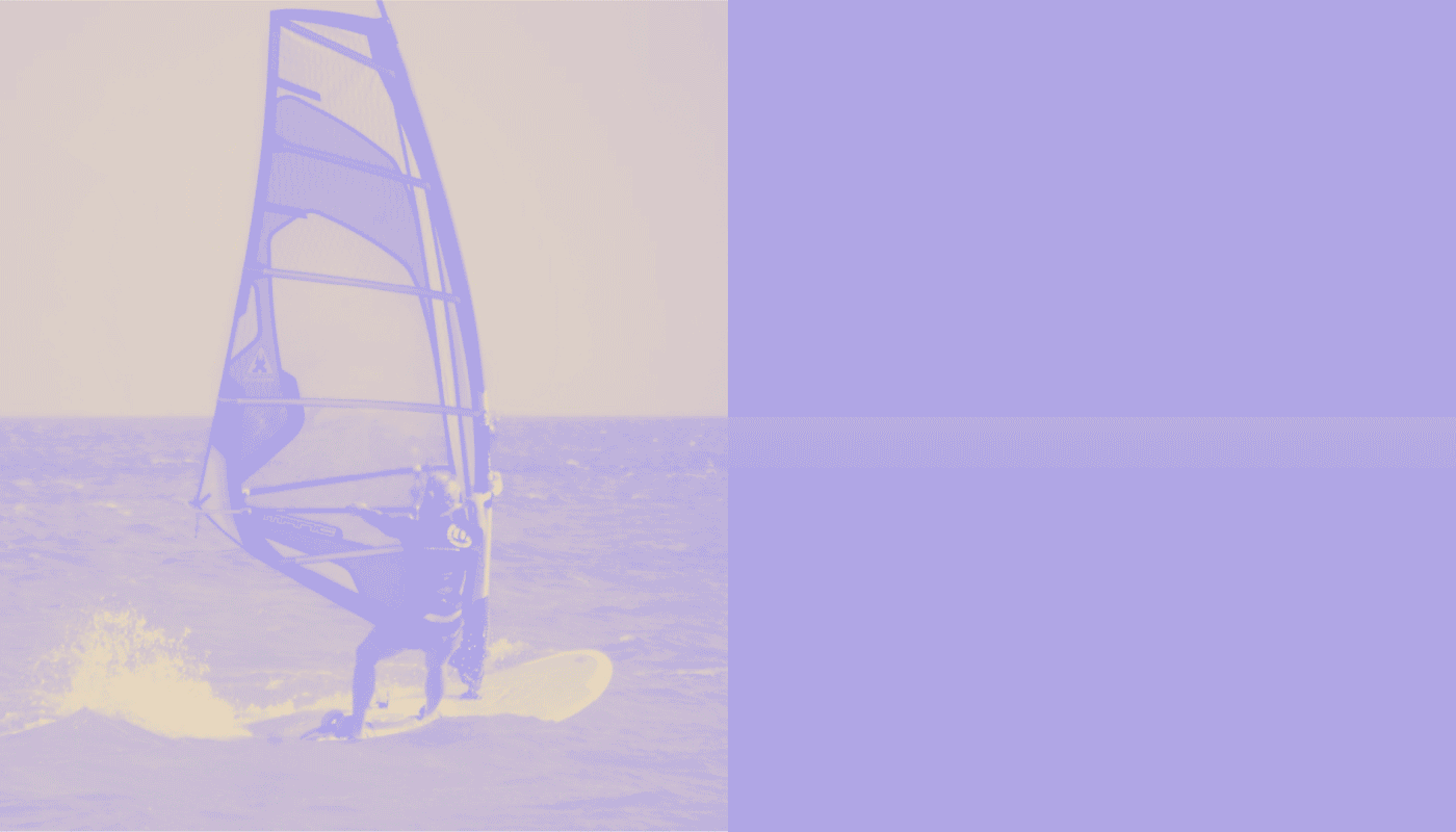
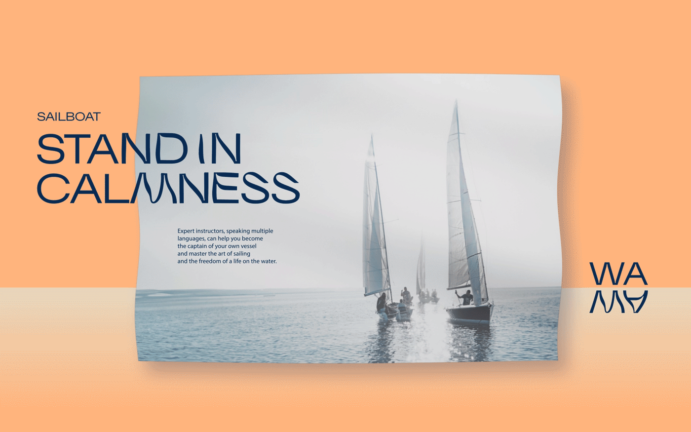
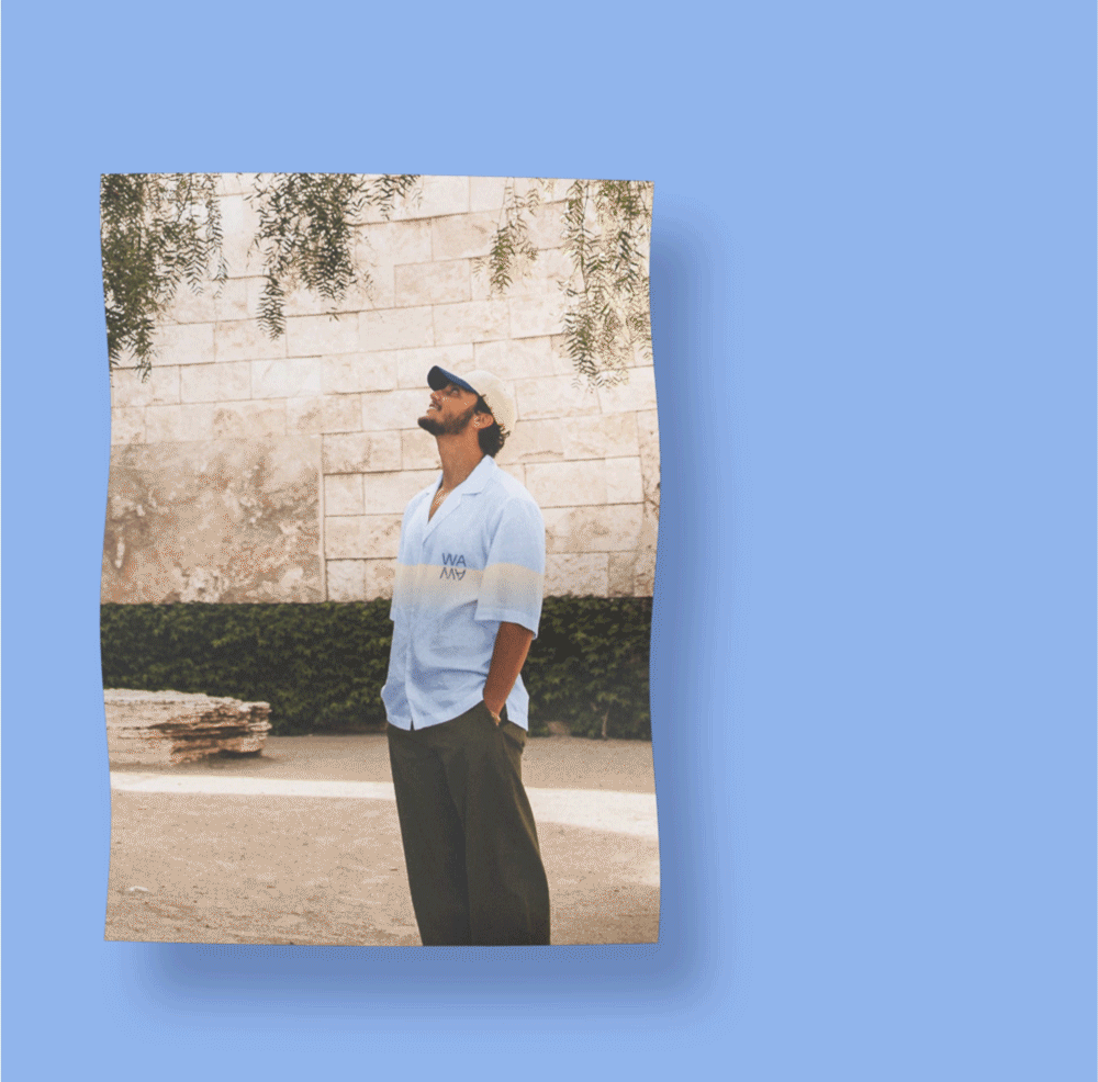
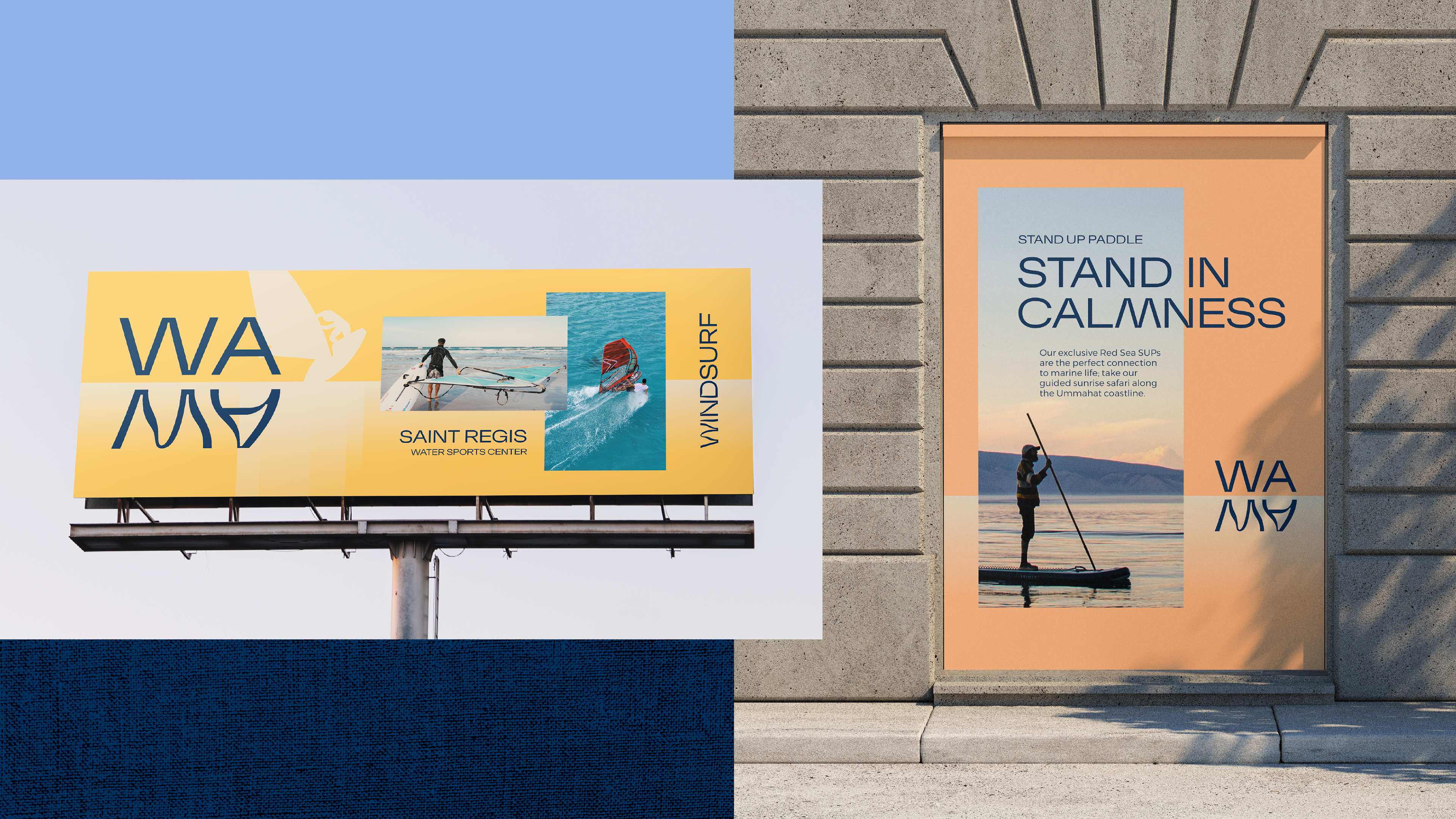
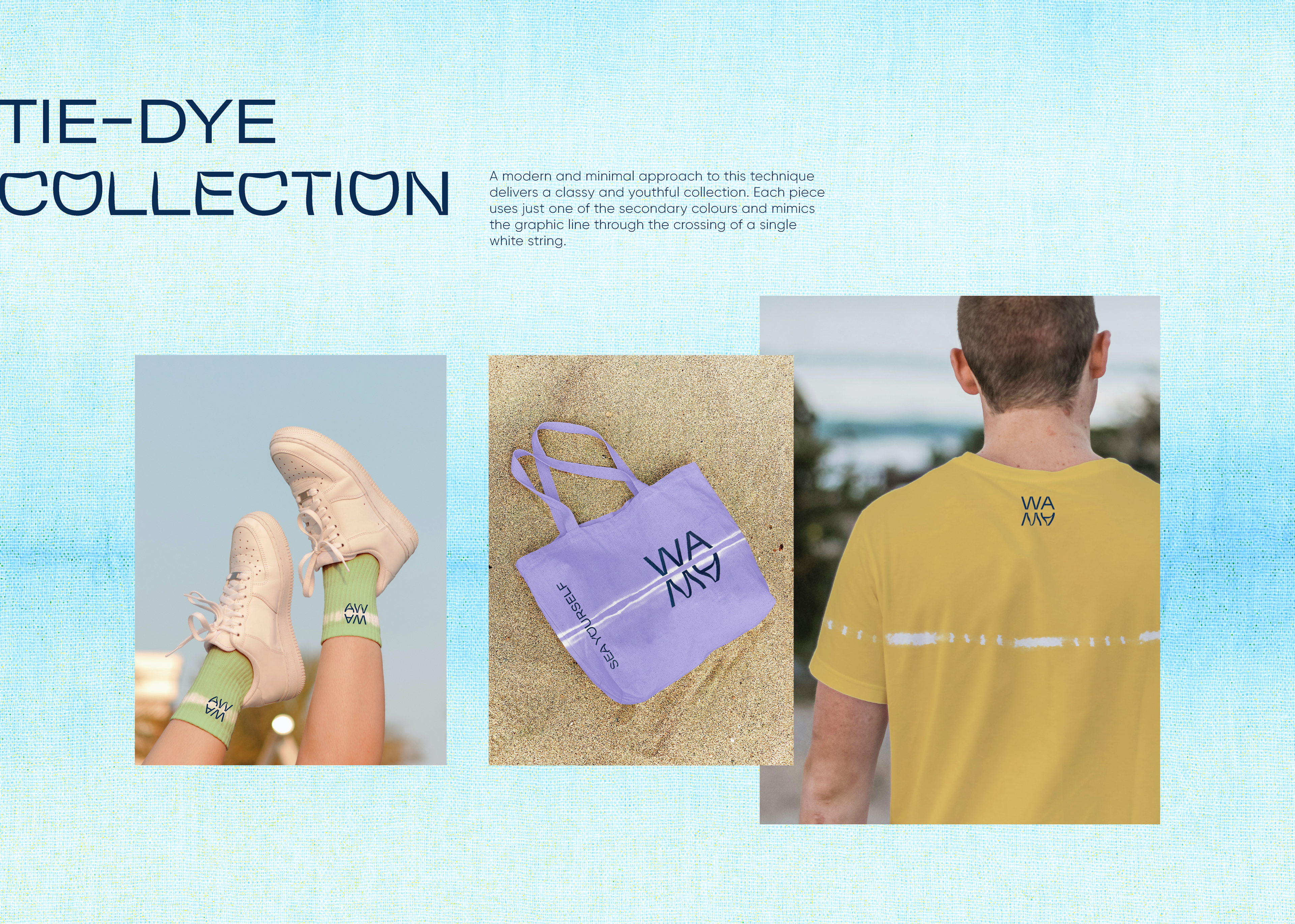
Reflection is the word, and the WAMA brand represents the mirroring
of the "WA" on the surface of the Red Sea calm waters, thus generating the "MA".
of the "WA" on the surface of the Red Sea calm waters, thus generating the "MA".
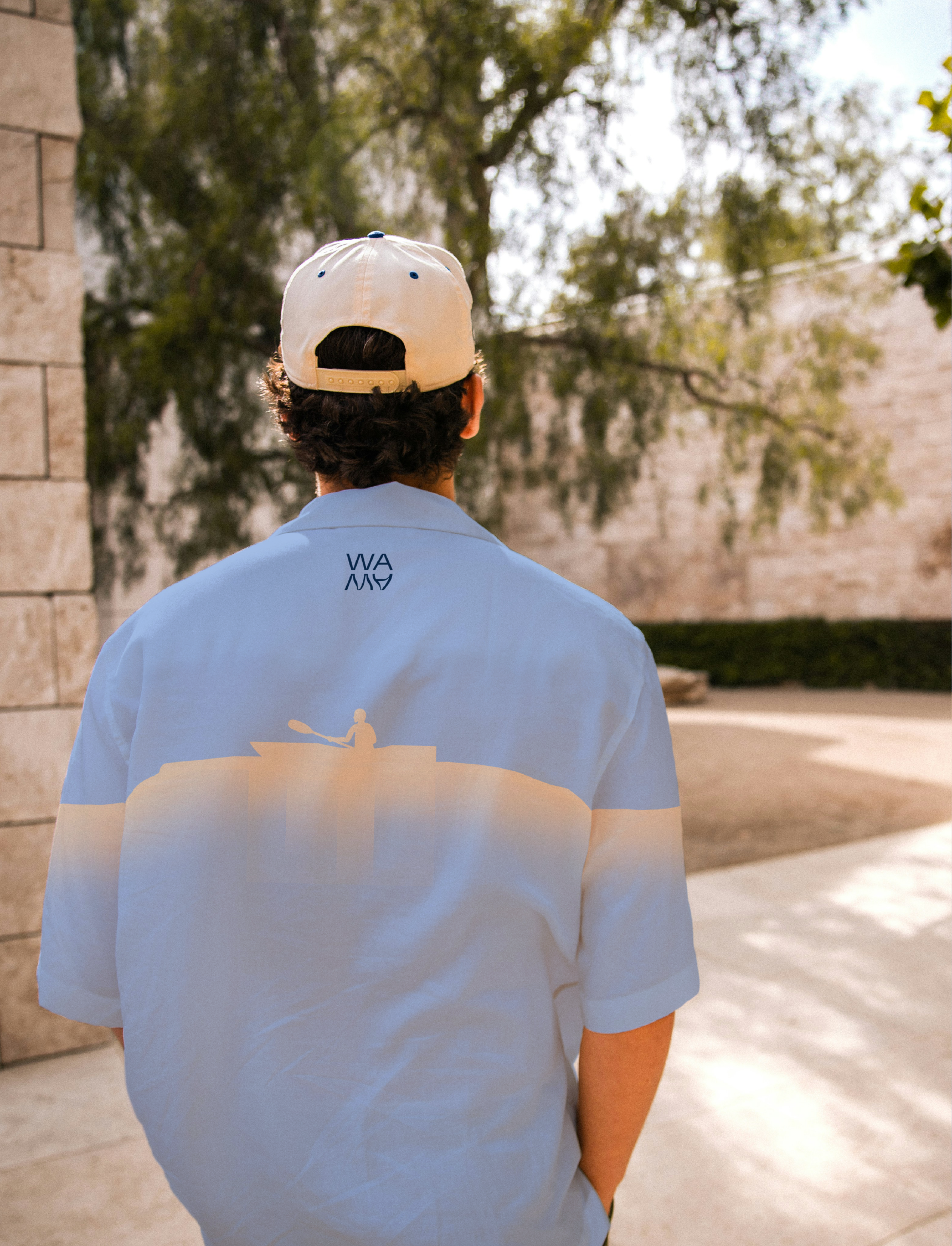
Pursuing this mirror-image idea, which is present throughout the entire project,
a special reflecting typography was developed. All the illustrations and layouts also
embrace the mimicking concept.
a special reflecting typography was developed. All the illustrations and layouts also
embrace the mimicking concept.
As for the brand name, it came from the combination of the words water (WA)
in English and Arabic (MA).
in English and Arabic (MA).
Together they create a sense of calmness and meaningful design communication,
always showcasing our concept: Sea Yourself.
always showcasing our concept: Sea Yourself.


You may also like